Great art makes you wonder,
great design makes things clear.
John Maeda, in ‘The laws of simplicity’
Great art makes you wonder,
great design makes things clear.
John Maeda, in ‘The laws of simplicity’
There are two ways to design a product for the widest possible audience. In other words, for everyone.
The former may lead to a great product that everyone has a use for. But often it leads to products that no one loves. It has too many unwanted features cluttering the experience for most users. And developing and maintaining all those features adds complexity and delays.
The latter leads to simple products. They don’t fulfill all the needs for anyone. But they fulfil some needs for everyone, without adding any clutter they need to deal with constantly. Not having to deal with the special features, and exceptional cases also makes them easier to develop and maintain.
Continue reading For everyone
The portfolio screen in the Coinbase app always opens on the “1 day” view. For all the talk of Crypto as an investment asset class, this one design choice exposes the reality.
Investors don’t look at a one day trend, or intra day lows and highs. Traders do.
I like observing people, and listening to them talk about themselves. So, naturally, I love observing user testing sessions. These are some unrelated (to the user test) notes from some recent sessions.
Like listening to audio books because can listen while doing other stuff… washing, walking, cooking, driving.
I’m emotionally blocked on the idea of listening to books. R loves them. But these are exactly the times when I listen to podcasts or, more recently, radio — walking, gardening, cooking, driving.
Have Bluetooth headphones but forget to keep charging them, so mostly use wired headphones.
Wonder if other heavy headphone users face this too. I’ve heard people saying they prefer wired headphones for audio quality, or Bluetooth unreliability reasons. This feels like a much stronger behavioural reason to me.
Love their Pixel phone – fits in the pocket, fantastic camera, clean, no crap apps. But miss lock screen player notification for Spotify app where they could pause, play and rewind (their previous Samsung phone had this).
This is likely a case of the default privacy settings on Pixel not allowing notification content to be visible on lock screen. A point for the privacy vs convenience debate, and the power of defaults.
Prefer browser to apps for news reading. Love the option to open lots of links from home screen in background tabs and then read them. With apps, can only read one at a time, and then FOMO kicks in – whether something more interesting/relevant down the page will disappear by the time they go back to the home screen.
I’m the same. My wife uses the Amazon app. I use the browser. I can search for something on Amazon, then open all interesting results in individual tabs, read them all, switching between them to compare, before deciding which one to buy.
The Pixel doesn’t have a back button, only a back gesture where you swipe from the right to go back. This interferes with swiping between photos. I accidentally close and go back when I need to go to the next photo.
I love gesture navigation. All my devices have it. I also agree with them. I do often, accidentally, close instead of swiping next. Interference with swipe actions on lists and cards is the same. The edge swipe for navigation drawer is just… dead.
It’s also interesting that they don’t know that we can swipe from either edge, left or right, to go back. Gestures are powerful once we learn them, but really hard to discover.
When looking at photos, videos start playing automatically. This happens everywhere these days. On photos, on Instagram, Twitter… can’t quietly check photos.
Attention/advertisement metric driven features spoiling UX. And yes, I hate this too.
tldr: Say no to switch toggles. Say yes to checkboxes. (Unless you are Airbnb)
Switches can be ambiguous about their state and their intent.
Which side is on?


Using an RTL language? Which is the on side—turned to the right, or to the left?


The accent colours on the switch are a helpful clue.
But the colours can’t help when Digital Wellbeing turns on the grayscale mode.

Yes, they do. They also appear to be learning the folly of their ways. Check out these screenshots from upcoming Android 12:


If it’s filled, it’s on. If it’s empty, it’s not.
There’s no right, left, up or down. Language doesn’t matter. Colour doesn’t matter. No ambiguity1. No confusion.


Martin Eriksson’s Venn diagram1 is an excellent representation of modern product organisations, and the role of product managers in them. The product managers sit at the centre of the product organisation, balancing and conducting the three key participants in the product organisation—business needs, UX and design, and the tech/development teams.
This post is not about Product Managers. Read Martin’s post for them. This is about the whole product organisation2, the interactions between the parts, and using the wonderful Venn diagram to represent it.

I like that this Venn diagram also neatly captures the three decisions that are made in the modern product development process —
The rationale for making a product, the why, is mostly provided by the business team, the sponsors, often the Hippos. Outside of a few organisations with empowered product teams, this decision usually exists as a one way flow. The business teams decide why the product needs to do what it needs to do, and the product team delivers on it. In the empowered teams, the product team may conduct user research and/or data analysis to verify that the why is valid before proceeding. If they find conflicting evidence, they may use the data to revisit the rationale with business team or leadership.
The second decision, what, is where most product managers spend most of their time. This is where they may map the provided why into specific features and products based on data analysis, user testing, or hypothesis (sometimes masked as experience). The product managers may then work with the UX and visual designers to turn the features into prototypes. These prototypes may then be tested, iterated, and refined, till we come to a final definition of the desired product.
The final decision, how, is then handed over to the engineering team. They will take the provided product definitions and designs, and code them into being. In more evolved product organisations, the engineers may be encouraged to interact with the users, the researchers, and the designers. They may be encouraged to better understand the user needs, and to provide feedback early in the product design cycle. On the other hand, in more engineering-focused organisations, the engineers may be encouraged to focus on the quality of how they create products, not what products are or why they create them or who uses them. In such organisations, the engineers’ interaction with the other participants is often limited to asking for clarifications when the design/definition may be unclear, and in deciding the ordering of tasks to be completed (sprint/product backlog management).
This reality of product organisations brings us to my other favourite aspect of that Venn diagram.
Martin’s diagram draws focus to the central overlap where the product managers work. I also like to think about the remaining three overlaps and how they induce discomfort in the organisation (making PMs even more pivotal).
Let’s start with the engineers. The engineers usually don’t have much direct overlap with defining business needs or decisions. Their interaction with the business and leadership is therefore largely restricted. Many engineers are also not very comfortable about facing the users. This can lead to reduced interaction with the UX research teams, and with need explorations. This further handicaps the engineers from providing deeper feedback into defining the what of the product.
The what team (UX) may interact with the business team to share insights from user research. They may also share the state/direction of designs and prototypes during iterations for feedback from business owners. But as custodians of the product design and direction, and as custodians of what users want, they may not often be very welcoming of inputs from outsiders—hippos suggesting features from their favourite apps or for their particular departmental needs, or engineers suggesting ideas based on latest platform design templates.
Finally, the business team, the sponsors, the Hippos, the owners of the why. They’re usually the highest ranked, in the larger organisational hierarchy, amongst all the participants in the product team. This often makes them aloof, and largely outside the product organisation. It takes a highly self-aware business leader to encourage, engage, and adapt to, feedback from rest of product organisation about the rationale of the operation. To accept challenges to the description of their why.
These base hurdles to direct, frequent cooperation between business, UX and tech are what makes the product managers important. The nature of these overlaps in a particular organisation defines the reality of product managers’ roles—from misclassified project managers to conductors of an orchestra to mini CEOs.
Another great quality of this Venn diagram is its adaptability to represent numerous types of product organisation. Here are three (of many).

The solo entrepreneur, the indie founders, the do-it-all dudette. They don’t have much choice, they just have to wear all the hats. Sometimes all together, at other times one or few at a time. The circles don’t have a perfect overlap because the solo founder may still seek outside help on one or more areas, some or all the time. But they are solely responsible for owning all the product decisions—why, what, and how.
Incidentally, this Venn diagram may also represent tightly knitted product teams where everyone multitasks. The kind where product engineers get involved in user interviews, where designers and engineers strive to understand what the data reveals, and where the business sponsors listen to feedback when the research doesn’t agree with their directions. These teams appear to be, sadly, even rarer than indie founders.
 This is a typical two founder startup—a tech person and a business person. The business person owns the why and the what (along with who and many other hats), while the tech person focuses on delivering the how.
This Venn diagram also mirrors how many product organisations with strong engineering culture work. The business team, the product managers, and the designers work together on defining the why and the what. This what is then handed over to engineering to deliver how they consider best. The engineering organisation focuses on excellence at converting the product definition into reality, and doesn’t focus too much over the product or users’ experience of it (within PM defines boundaries).
 The startup will hopefully turn into a scale up, which may one day become a large enterprise. Somewhere along that journey, the product organisation turns into this shape.
Business, UX/UI, engineering, even product management, live within their own independent hierarchies. They work together on products, but they live in, are measured by, and adhere to norms of their own vertical organisation. This draws them apart, makes interfaces rigid, and interactions distant.
This is also when innovation slows down, and often the enterprise calls in management consultants like me. We will usually bring together small teams of people from these verticals, and get them working together, quite like in the Venn diagram up top. If it’s a short term project, we’ll call it a design sprint or an ideation sprint. If it’s more permanent, we’ll call it the skunkworks or the innovation division or the new product development team. In reality, all we do is break small chunks from the organisational silos and get them to operate like the product organisation that from way back when…
We got a BT Sport subscription last month to watch Champions League and Europa League matches. The stream (we watch on the TV using Chromecast) often paused and skipped, often over entire plays, and at least once over a long sequence including the goal. It was terrible.
Before the finals, we remembered that BT Sport streams the two finals free on YouTube. So, halfway through the Europa cup final, I switched to streaming from YouTube. It was flawless. There was no pause-and-skip. At all! For the Champions League final, I didn’t even bother switching on the BT Sport app, and went direct to watching on YouTube.
BT Sport isn’t the only company with a terrible live streaming product. Eurosport player’s pause-and-skip is terrible, making all sports unwatchable. ITV is so aware of its terrible product that it doesn’t even offer live streaming on Chromecast, only recorded programs are available. These are just the ones I’ve tried1.
This got me thinking. YouTube has some of the best2 streaming infrastructure and knowhow. For instance, they understand that continuity is more important than quality in live streaming, so their algorithm dynamically reduces video quality instead of pausing live streams. They have content delivery deals with most network providers globally, helping reduce lag and data transfer. They basically already have all the infrastructure for a successful streaming platform.
What would Amazon have done if it owned YouTube in its current state? They would have productised the YouTube streaming platform, a la AWS and Amazon logistics, and opened it up for any company to use.
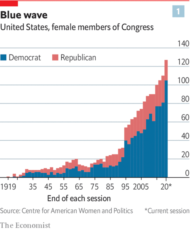
This chart in The Economist bothered me. It’s not a bad chart, but it could convey the data so much better if just the order of columns was reversed.

Once the data is reversed, it’s much clearer to see the relatively stagnant number of Republican women in Congress, along with the increase in Democrat women in Congress.
Pay people based on how well they do their current job.
Promote people based on how well they’re suited to the next job.
Both need not, often will not, be the same people. That is fine.
Chat apps were once for digital p2p1 communication—chatting.
Now chat apps have become the media for news, faux news, entertainment, memes, commerce, and more. They are a combination of, for old school web-ers, a portal, a usenet or yahoo group or bulletin board, and mass email (with everyone in cc).
With chat apps no longer primarily the medium for p2p digital communication, what is the new chat app?
In corporate environment, this p2p role is partly fulfilled by Slack DMs and email. Which app will fulfil this role in personal use case?


