The portfolio screen in the Coinbase app always opens on the “1 day” view. For all the talk of Crypto as an investment asset class, this one design choice exposes the reality.
Investors don’t look at a one day trend, or intra day lows and highs. Traders do.
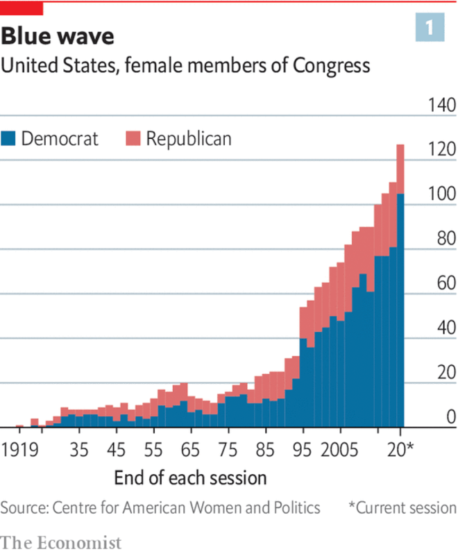
This chart in The Economist bothered me. It’s not a bad chart, but it could convey the data so much better if just the order of columns was reversed.
My reversed stack
Once the data is reversed, it’s much clearer to see the relatively stagnant number of Republican women in Congress, along with the increase in Democrat women in Congress.
Escalator stop buttons at Waterloo station, London
They look pretty, in a industrial chic kind of way.
The idea is interesting—
Red action button in the middle,
Operation instruction around it—‘Push to stop’, and
Warning around that—‘Penalty for improper use’
And the execution is precise—the button’s radius, the width of gap around the button, and the width of ‘Push to stop’ ring appear beautifully aligned.
Every time I pass them, I get attracted to these buttons.
There’s just one problem. On every attempt, I read the message around the button as:
Penalty for push to stop improper use.
The clarity of message has been forsaken at the altar of design.
Humans don’t read in concentric circles. We definitely don’t read inside-out.
We read from left-to-right, or right-to-left, and top-to-bottom.
In an emergency, when this button would be usually used, we follow instinct—read as we usually do. Not as the designer wants us to—inside out, concentric circle at a time.
This button would be much simpler, and not much less prettier, if it just said ‘Push to stop’ up top, and ‘Penalty for improper use’ at the bottom. (My ugly sketch is below the fold)
Income tax rates are based on current/last year’s income. This makes them easy to calculate and implement.
This immediacy of taxes also makes them painful, and makes the tax slab thresholds as artificial barriers to income mobility. An example of this is when we get a raise which pushes us from near the top end of one tax rate bracket, to the bottom end of a higher tax rate bracket. This frequently means that even though the employer is paying us more after the raise, we are actually taking home less money due to a higher tax rate.
Government benefits work similarly. For example, the unemployment benefit / social support payments cut off (or reduce dramatically) when we start working. However, after accounting for taxes and loss of benefits, the take home income from pay is often lower than the unemployment benefits.
I had an appointment at the hospital today, and was thinking about the rates at the hospital car park. The parking area at big NHS hospital in my town has the highest parking rates around. They are probably more than double the rate at any other paid parking zone in the town.
At a first look, they seem extortionist. At most places, high parking rates are a nudge for users to either take an alternate means of transport, or to curtail their visits. At a hospital, however, few people visit by choice. Also, the visitors are more likely to use a car – comfort for the ill and all that. By charging these, probably ill, visitors these extraordinarily high rates, the hospital/NHS/council are just heartlessly milking the already suffering.
Unjust!
On a second thought, however, there is a valid reason behind these high rates – consumption tax. They are not just parking rates, they are an indirect tax on the heaviest NHS users.
That chart from the BBC got me interested. Looking at the Premier league table distributed by points makes it lot more interesting than distribution by ranks.
So, I downloaded the Premier League data for current season from Football Data, and created some graphs1.
Weeks 1-8: Mixed bag, except for Crystal Palace
Crystal Palace’s dismal start to the season
7 straight defeats! Crystal palace really had a crap start to the season!
Premier league teams on a linear scale of points after 23 matches
The usual Premier league table gives a good idea of the ranking, but the gaps between teams aren’t immediately obvious1. I love how this visualisation shows both the rankings and the gaps with one simple line.