Stacked chart—order of data series

womenInCongressEconomist
The Economist’s stack

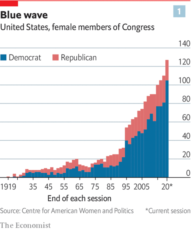
This chart in The Economist bothered me. It’s not a bad chart, but it could convey the data so much better if just the order of columns was reversed.

moc_area_1
My reversed stack

Once the data is reversed, it’s much clearer to see the relatively stagnant number of Republican women in Congress, along with the increase in Democrat women in Congress.

Continue reading Stacked chart—order of data series

Premier league table 2018-19 – some trends so far

Time to revisit the excellent BBC chart from last year. Here’s how things stand in the premier league after 21 matches:

Premier League table after 21 matches

Observations (relative to last year):

  1. There’s no runaway winner at the top,
  2. The middle is again crowded (8 teams within 9 points) but not as much as last year (13 teams in 11 points),
  3. The bottom 6 are scattered as well, with Huddersfield struggling the most (more on them below).

aditya

Premier league table – the trend continues

Follow-up to the last week’s post.

Premier League table - spread by points - week 21 - 2
Premier League table – spread by points – week 21 – 27

All the trends from the previous week continue…

  1. Manchester City (blue) continue to run away with the title, West Brom (slate) continue a lonely run at the bottom.
  2. The 2nd and 5th placed teams are now just 4 points apart (red) – Manchester United lost, while Chelsea, Tottenham, and Liverpool all won.
  3. Arsenal (slate) continue to be in the middle of nowhere – 7 points behind 5th, 9 points ahead of 7th.
  4. The mid-table / relegation pack (light grey) got even tighter – only 11 points between the 7th and 19th placed teams.

Continue reading Premier league table – the trend continues

Premier league table – some trends this season

That chart from the BBC got me interested. Looking at the Premier league table distributed by points makes it lot more interesting than distribution by ranks.

So, I downloaded the Premier League data for current season from Football Data, and created some graphs1.

Weeks 1-8: Mixed bag, except for Crystal Palace

Crystal Palace's dismal start to the season
Crystal Palace’s dismal start to the season

7 straight defeats! Crystal palace really had a crap start to the season!

Continue reading Premier league table – some trends this season

Chart of the day: Premier league table

Premier league teams on a linear scale of points after 23 matches

The usual Premier league table gives a good idea of the ranking, but the gaps between teams aren’t immediately obvious1. I love how this visualisation shows both the rankings and the gaps with one simple line.

Source: BBC sport

Continue reading Chart of the day: Premier league table