Stacked chart—order of data series

womenInCongressEconomist
The Economist’s stack

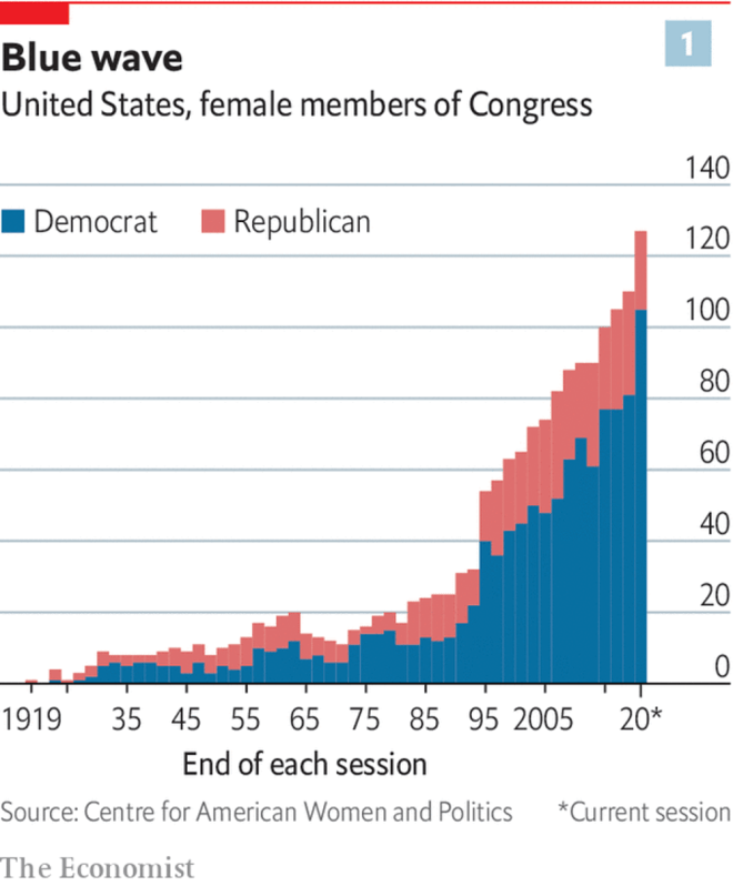
This chart in The Economist bothered me. It’s not a bad chart, but it could convey the data so much better if just the order of columns was reversed.

moc_area_1
My reversed stack

Once the data is reversed, it’s much clearer to see the relatively stagnant number of Republican women in Congress, along with the increase in Democrat women in Congress.

Continue reading Stacked chart—order of data series

Premier league table 2018-19 – some trends so far

Time to revisit the excellent BBC chart from last year. Here’s how things stand in the premier league after 21 matches:

Premier League table after 21 matches

Observations (relative to last year):

  1. There’s no runaway winner at the top,
  2. The middle is again crowded (8 teams within 9 points) but not as much as last year (13 teams in 11 points),
  3. The bottom 6 are scattered as well, with Huddersfield struggling the most (more on them below).

aditya

Premier league table – the trend continues

Follow-up to the last week’s post.

Premier League table - spread by points - week 21 - 2
Premier League table – spread by points – week 21 – 27

All the trends from the previous week continue…

  1. Manchester City (blue) continue to run away with the title, West Brom (slate) continue a lonely run at the bottom.
  2. The 2nd and 5th placed teams are now just 4 points apart (red) – Manchester United lost, while Chelsea, Tottenham, and Liverpool all won.
  3. Arsenal (slate) continue to be in the middle of nowhere – 7 points behind 5th, 9 points ahead of 7th.
  4. The mid-table / relegation pack (light grey) got even tighter – only 11 points between the 7th and 19th placed teams.

Continue reading Premier league table – the trend continues

Premier league table – some trends this season

That chart from the BBC got me interested. Looking at the Premier league table distributed by points makes it lot more interesting than distribution by ranks.

So, I downloaded the Premier League data for current season from Football Data, and created some graphs1.

Weeks 1-8: Mixed bag, except for Crystal Palace

Crystal Palace's dismal start to the season
Crystal Palace’s dismal start to the season

7 straight defeats! Crystal palace really had a crap start to the season!

Continue reading Premier league table – some trends this season

Chart of the day: Premier league table

Premier league teams on a linear scale of points after 23 matches

The usual Premier league table gives a good idea of the ranking, but the gaps between teams aren’t immediately obvious1. I love how this visualisation shows both the rankings and the gaps with one simple line.

Source: BBC sport

Continue reading Chart of the day: Premier league table

Cropped axes – a flag for misrepresentation

Economist's misrepresentation of car prices, and how much of it is tax credits.

Saw this chart – on prices in a car segment in the US – in this article in The Economist. I just couldn’t get over how grossly it misrepresented the data, so here’s the crib.

Illusion

On a quick look, the chart above seems to indicate that the US government discounts electic car prices by anywhere from 37.5% (BMW i3) to 60% (Tesla Model 3) of the total price – the ratio of light blue bar segment to total.

The reason for this apparent fallacy is the cropped axis on which the values are plotted – instead of starting from zero, it starts from about $22,500 and goes up to $45,000. Adding to the crime of cropping is the location of the axis labels – in the already text heavy section on top.

Result: most viewers would casually interpret that tax credits form a huge rebate on electric cars.

Reality

Electric Car Pricing - Corrected Axis Chart

The interpretation changes quickly when the axis is expanded to start from zero.

The tax credit is now clear as just a small share of the real price – a standard $7,500, whatever the car price – rather than a hefty 60% for a Tesla Model 3.

What’s more, it now highlights how competitively priced the Tesla Model 3 and Chevy Bolt are, even if the price subsidy is removed – only BMW 3 series beats them. And that’s before the running & servicing cost savings are accounted for.

Don’t crop the axis!!

Based on my experience of reading, and creating, countless charts – one of my key learnings is simply:

If the axis are cropped, the chart creator is trying to send a false reading – so dig in deeper.

In the case of this chart, the cropping is compounded by hiding the labels in the text heavy section of the graphic.

It’s either a super lazy job by the chart making (and the editor). Or a case of making the chart fit the story / bias.

Please, don’t do it.
How I automate fetching Chrome Web Store user counts & ratings

Ego booster (or deflator) charts

I have 7 Chrome extensions and apps and, as a chronic numbers addict, I like to keep track of their user numbers (WAU), and ratings.

I use a spreadsheet (Google Sheet) to collect the data, and analyze trends, and catch (to diagnose) outliers. The same spreadsheet also functions as a JSON-providing backend for data being funneled elsewhere (e.g. for user numbers on this page).

While the analysis part, and the JSON-feed worked well, the data collection part was painful. Google doesn’t provide an API to fetch extension data, so I’ve had to fill the data manually into the spreadsheet every day!

For a long time, I used to open my Chrome Web Store (CWS) developer dashboard every morning, and one-by-one fill in the numbers into the spreadsheet cells. While this was relatively easy, if menial, on the desktop, it’s quite painful on the phone – copying numbers between two apps on the small screen.

Continue reading How I automate fetching Chrome Web Store user counts & ratings