This is a supplementary note to the opinion note on Pricing.
Current sign-up flow
WordPress.com uses an elegant multi-step sign-up flow that gets users started with a relevant, polished and personalised website that they can build upon.
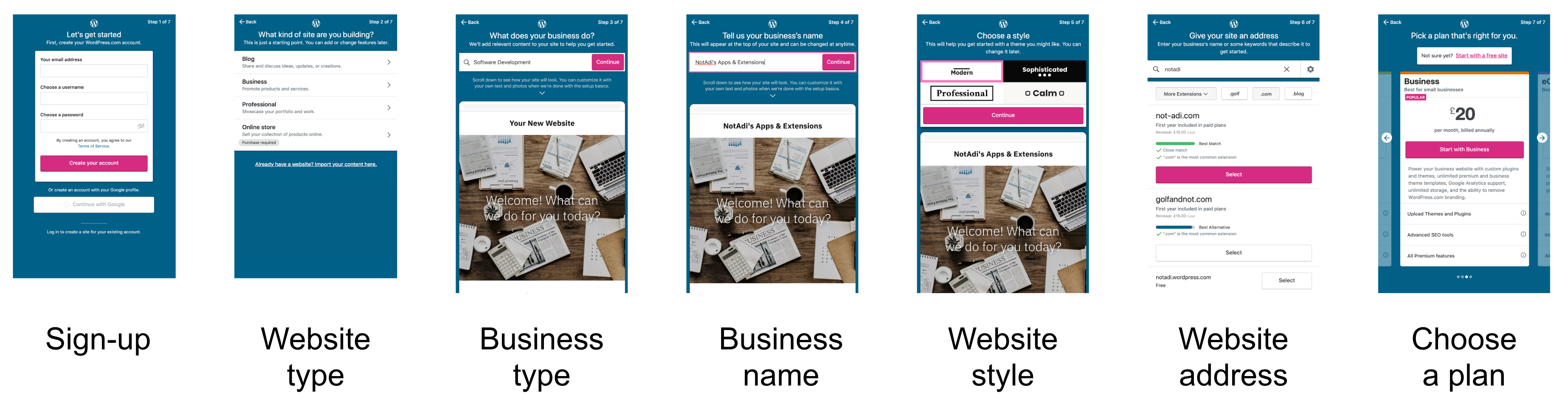
Current WordPress.com sign-up flow (sample site)
However, the current sign-up flow begins with a user conversion hurdle—a sign-up screen. After collecting some personalisation information, it ends with another conversion drop-off hurdle—the payments plan choice screen.
A sign-up screen upfront appears abrupt. It also presents an unnecessary hurdle before we even know our customer. Hiding the pricing plans at the end makes us appear insincere, and creates another opportunity for users to drop out.
The current sign-up flow is a very good starting point. It just needs to be tweaked for compatibility with the new pricing system. These changes may even improve sign-up conversion rates. The key is in ordering of the sign-up screens.
Suggested sign-up flow
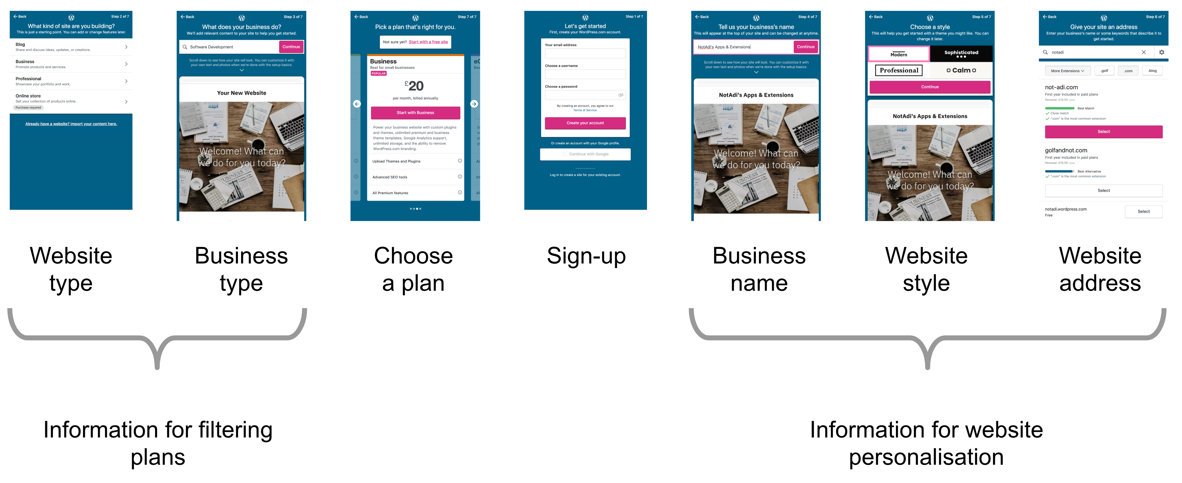
Suggested WordPress.com sign-up flow
The suggested sign-up flow consists of the same screens as the current one, but in a different order. It has three distinct sections:
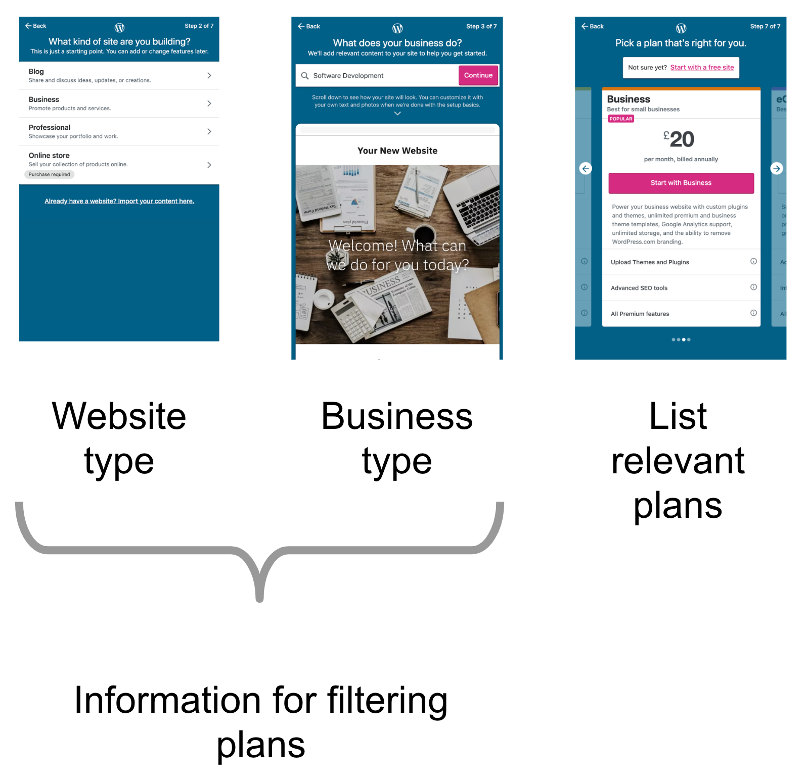
Getting basic information from the user to help us filter them into a relevant persona.
The first two screens accomplish this—understanding the type of website a user wants and their target audience.In the second step, the user selects a pricing plan and registers.
We use the information from the first two screens to present the user with a very short list of relevant plans. The order of these two screens—plan selection and registration—may be switched based on user testing.Finally, we gather website personalisation information from the user.
These are the final three screens—business name, website style and website address.
If the user has chosen a plan which doesn’t support a custom website address, this feature may be up-sold here as an add-on or by suggesting a different plan.
Additionally, we may update the success screen for premium plan users by showcasing the top three relevant add-on features. (e.g. Google Analytics on the Blogger plan)
Finally, if the user’s current plan + add-ons cost more than an existing plan with the same features, we should prompt them to switch to the cheaper plan.
The pricing page
The updated pricing page is just the first three steps of the new sign-up flow.
Updated pricing page
Once a user has provided inputs on the first two screens, we may store this data in cookies. The user can then be immediately shown relevant pricing plans on their subsequent visits. We may then also skip the first two steps when they sign-up.
One last thing

Please don’t start the WordPress.com homepage with a list of pricing plans.
Let’s start with features, with success stories, with the possibilities, and with the Automattic story. We should provide a clear, prominent link to the pricing page. But let’s not start the homepage with it, please.
All opinion notes:
- We need to do something about the WordPress.com Reader
- Jetpack: the Automattic experience for WordPress
- WooHoo.com—a hosted, tightly-integrated version of WooCommerce
- Woo Two — More ideas for WooCommerce
- Earn with WordPress
- Pricing—more and less
- WordPress.com new user sign-up flow
- TBC: A publishing platform for today’s content formats